Claims Copilot • Microsoft × Confidential Enterprise Client
Tasked with visualizing Microsoft's complex enterprise insurance solutions, I led the full animation pipeline...
Read Case StudyTasked with visualizing Microsoft's complex enterprise insurance solutions, I led the full animation pipeline...
Read Case StudyA completely self-directed long-form documentary series uncovering the raw, real journeys of startup founders. Handled end-to-end production including cinematography, lighting, editing, and distribution.
Read Case StudyLed seasonal and performance marketing campaigns for a global Spanish brand, translating international brand guidelines into culturally resonant assets for the Indian market.
Read Case Study


Video Production Consultant within Microsoft's internal creative unit, Studio 42. Contracted via Kaara Info Systems. Team distributed across India, the US, and Europe.
An AI copilot integration for a major European insurance provider's claims portal needed to be communicated to an entire organisation — from frontline claims handlers to C-suite. The product was invisible infrastructure. The story had to make abstract technology feel human and measurable.
Led the full animation pipeline — concept, scripting direction, storyboarding, 2D character animation, UI animation, sound design, and final delivery. Designed seven original characters and built the complete narrative around a before/after claims journey. Developed a reusable After Effects system — colour palette, component library, named layer architecture — so the client's team could navigate and adapt the project independently. Coordinated a six to seven person team across four functions.
Delivered to the full organisation including CEO and COO level. Response from senior leadership led directly to continued studio engagement. Production timeline maintained across a distributed international team under an accelerated enterprise schedule.
Delivered under NDA. Visual assets available on request for verified hiring contexts.
Insurance claims processing is slow, fragmented, and human-heavy by design. When Microsoft developed an AI copilot integration for a major European insurance provider's claims portal, the challenge wasn't just building the technology — it was helping an entire organisation understand and adopt it.
I was brought in as Video Production Consultant within Microsoft's internal creative unit, Studio 42, to lead the animation project that would introduce this integration to the client's teams. The deliverable: a single, definitive product animation that would serve as both internal onboarding material and external training — reaching everyone from frontline claims handlers to C-suite leadership.
The brief had two layers, and both were genuinely difficult.
The first was conceptual. The product being communicated — an AI copilot embedded into a live claims workflow — was invisible infrastructure. There was nothing inherently visual about it. The real story was the difference it made: the gap between how a claims handler worked before and after the integration. That before/after had to be felt, not just shown.
The second was operational. I was coordinating a distributed team across India, the US, and Europe, synthesising input from scriptwriters, UI designers, and a voiceover director — none of whom shared a timezone, and all of whom had creative opinions. UI assets were still being built when animation had to begin. I worked with placeholder screens and green-filled panels to maintain momentum while waiting for final interface elements.
An early attempt at live-action character work was abandoned after testing — the results didn't meet the quality standard the project required. The decision was made to move entirely to 2D character animation, which reset part of the production schedule.
My first question to the team before touching any software: live action or animation, and what exactly needs to be communicated? Locking those two decisions early eliminated the largest source of ambiguity and gave the entire project a clear visual direction from day one.
Rather than committing to a single direction, I developed three distinct concept directions before any animation began:
• Direction A — Full live action
• Direction B — Live action with 2D character integration
• Direction C — Full 2D character animation
3D was ruled out early — not because it couldn't work aesthetically, but because it would have pushed the timeline beyond what the project could absorb.
The team aligned on Direction C. The narrative logic was straightforward and deliberate: show the claims handler's world as it was — fragmented, slow, high-effort — and then show what changes when the AI enters the process. Not a feature list. A human story with a measurable before and after.
A project involving seven original characters, multiple UI environments, and a geographically distributed team requires architecture, not just animation.
Before production began, I defined:
• A fixed colour palette governing the entire visual language
• UI screen design standards for all portal sequences
• Reusable lower-third templates and character motion components
• A layer naming and linking system structured so that a single parameter change could propagate across the project without breaking dependencies
The final deliverable package was built for handover, not just submission. It included the full After Effects project with all files linked and labelled, Illustrator source files for every asset, storyboards, and an MP4 master optimised for multiple platform contexts via Media Encoder. The intent was that the client's team could navigate, adapt, or extend the project without requiring my involvement.
Cast of characters created from scratch:
Jasper (Claims Handler), the AI Copilot Robot, Eline (Insurance Broker), Andrea (Client — pizza shop owner), Francesca (Andrea's employee), Pieter (Loss Adjuster), and a Doctor. Seven original characters, fully animated.
The story structure:
The film opens on Jasper navigating the old system — the friction, the waiting, the manual process. The AI Copilot enters. Then the stakes increase: Andrea's pizza shop burns down. Her employee is injured. Under the old system, a claim of this complexity would take weeks. With the AI-integrated workflow, it resolves in three to four days. The film ends on resolution, not features.
Tools used and why:
• Adobe Illustrator — all character design, asset creation, storyboards
• Adobe After Effects — full 2D animation and motion design
• Premiere Pro & Media Encoder — assembly and optimisation
• ElevenLabs — music and sound design
The most technically demanding sequence was visualising the weight of the old claims process — making bureaucratic delay feel tangible and human on screen. It required building animation around a process I had never personally experienced, from research and inference alone.
The project went through five to six revision cycles. Each cycle addressed missing detail or narrative clarity. The work improved materially with each pass.
My role on this project extended well beyond animation. I coordinated a team of six to seven people across four functions: Scripting, UI design, Voiceover direction, and Animation/sound.
• Scripting team — I briefed the narrative arc, tone, and visual logic before a word was written
• UI design team — I specified every screen required, its context in the story, and how it would animate
• Voiceover direction — handled by a senior team member; I reviewed and approved
• Animation and sound — executed entirely by me
Creative disagreements happened regularly. My approach was consistent: when a conflict arose, I mapped the decision against its downstream consequences — what does choosing this mean for the next three scenes, the timeline, the client's expectation? That framework moved debates from opinion to consequence, which shortened resolution time and produced better decisions.
A dedicated stakeholder liaison handled all client communication. I focused entirely on production quality and team alignment.
Claims Copilot was distributed across the entire organisation of a major European insurance provider — claims handlers, brokers, agents, and senior leadership including CEO and COO level. For an internal onboarding film, that reach represents full organisational penetration at the point of a major technology adoption.
The response from senior management was strong enough to generate continued engagement with the studio for subsequent projects.
The clearest measure of impact is this: a technology that lives inside a browser portal — invisible, abstract, difficult to explain — was communicated clearly enough that an entire enterprise organisation could understand and adopt it. The animation did the job it was built to do.
*Project delivered under NDA. Client name withheld by agreement. Visual assets available on request for verified hiring contexts.


Self-initiated project. Founded, produced, and delivered as Creative Producer — no client brief, no external mandate. Prior to this, I had worked at Wittyfeed, one of the subjects featured in the series.
Extraordinary people in Tier 1 and Tier 2 Indian cities — founders, community builders, quietly exceptional individuals — had no platform. Most were camera-shy, none were trained on-screen performers. The challenge was building a repeatable documentary format that could capture genuine stories without losing authenticity to production structure.
Designed the full show format and production system: fixed set and lighting rig, branded intro and outro, lower third templates, subtitle standards, and a multi-platform export pipeline covering YouTube, Instagram, Facebook, LinkedIn, and YouTube Shorts. Built a short-form contingency model into the production architecture from day one. Directed, shot, edited, and delivered all episodes. Managed six to seven people per production including crew, talent, and vendors.
Episode One — featuring Vinay Singhal, Co-Founder of Wittyfeed and Stage OTT — ran 24 minutes and generated 80,190 views. Channel reached 53,000 subscribers. Singhal subsequently cited the show publicly as the platform where he chose to speak about the Wittyfeed crisis for the first time. When the pandemic forced the team to disperse, the pre-built short-form contingency model activated as designed.
Most cities have people worth knowing about. Founders who rebuilt from nothing. Individuals doing something extraordinary without an audience. Stories that don't surface because no one went looking.
The Savage Humans Show was built to find those people and put them on camera.
I conceived, produced, and delivered the show as an original long-form documentary series — entirely in-house, without a client brief or external mandate. The format was simple: one person, one real story, told with honesty and without performance. The subjects were entrepreneurs, community builders, and quietly exceptional individuals from Tier 2 and Tier 3 Indian cities who had never been given a proper platform.
Before founding The Savage Humans, I had worked at Wittyfeed — at the time India's number one viral content platform. I had seen that world from the inside. When I left and built my own production platform, I knew exactly whose story deserved to be the first episode.
The show was produced for YouTube, Instagram, Facebook, and LinkedIn — with a parallel short-form strategy built into the pipeline from day one.
The hardest part of this project had nothing to do with software.
The people worth featuring were almost universally camera-shy. They hadn't been on interviews. They didn't think of themselves as stories worth telling. Convincing them to sit down, speak honestly, and follow a narrative structure — without losing the authenticity that made them worth filming in the first place — was the core creative and human challenge of every episode.
Alongside that, scripting non-actors is a specific skill. These weren't performers who could take direction and deliver a line. They were real people with real stories, and the script had to serve as a loose framework rather than a rigid text — guiding the conversation without flattening it.
On the production side, I was running the full pipeline: research, pre-production planning, directing, post-production, and final delivery. Every episode was a complete production cycle managed from a standing start.
Before anything else, I researched. Every subject was studied thoroughly before a camera was switched on — their background, their story arc, the specific moment of failure or pivot that made their journey worth telling.
The format decision was made early and held throughout: live action only. No animation, no motion graphics beyond show elements. The emotional connection the show needed to build required real faces, real environments, real pauses. Any visual layer between the subject and the audience would have diluted that.
The narrative structure was defined and locked for the series:
Introduction → The Problem → Peak of the Problem → The Turn → Life After
This wasn't arbitrary. It mirrors the structure of every story that has ever held an audience's attention. Applying it consistently across episodes gave the show a reliable emotional rhythm while leaving room for each subject's specific story to breathe within it.
A show format only works if it can be produced repeatedly without rebuilding from scratch each time.
Before filming began, I designed the full production system:
• Set design — fixed background, defined lighting rig, consistent seating position across all episodes
• Show identity — branded intro and outro, lower third templates, subtitle format, all animated in After Effects
• Export pipeline — format specifications defined per platform: YouTube long-form, Instagram, Facebook, LinkedIn, and YouTube Shorts
Critically, the short-form strategy was not an afterthought. Knowing that a long-form show is vulnerable to resource constraints, I built a contingency model into the production plan: if the show ever needed to continue with reduced capacity, the same stories could be repurposed into UGC-style short-form content without a full production crew.
When the pandemic hit and the team dispersed, that contingency plan activated exactly as designed. The format survived the disruption because the architecture anticipated it.
Episode One: Vinay Singhal, Co-Founder & CEO — Stage OTT
I had worked at Wittyfeed before starting The Savage Humans. I knew what that company had built, and I had watched from proximity as the industry processed what happened to it. When Facebook removed Wittyfeed's pages — overnight, without warning — the platform lost its primary revenue engine instantly. Seventy-five percent of the team left. The remaining staff absorbed a 75% salary cut.
Vinay Singhal called the full team together. He told them he understood if they had to leave. He asked those who stayed to commit to six months. From that moment, he rebuilt — launching Stage OTT, a regional language entertainment platform that went on to win multiple industry awards.
That story — of a founder choosing transparency over performance at his lowest point — was the subject of Episode One. The fact that I had been inside that industry gave the interview a different quality of depth. I wasn't asking a stranger about a crisis. I understood the stakes from the ground level.
Vinay subsequently referenced the interview publicly on other platforms, noting that The Savage Humans Show was where he chose to speak about the Wittyfeed crisis for the first time. That context — a former colleague creating the space where a founder felt safe enough to speak openly — is not something a cold production can manufacture.
I managed six to seven people across each episode production: crew members, on-screen talent, and external vendors. As Creative Producer, I held responsibility for every phase — research, pre-production, directing on set, and the full post-production pipeline.
Conflicts arose during the process. My consistent approach was to work through disagreements using a structured pros-and-cons framework — mapping each decision against its effect on the episode's quality and production feasibility. Two to three revision cycles per episode, each one materially improving the final cut.
Episode One — Vinay Singhal's story — ran for 24 minutes and 5 seconds and generated 80,190 views. The channel reached 53,000 subscribers.
Vinay Singhal referenced the interview publicly on other platforms, noting that The Savage Humans Show was where he chose to speak about the Wittyfeed crisis for the first time. That endorsement — from a founder of his profile, about a moment that defined his career — was unsolicited and unprompted.
Three episodes were produced before the pandemic ended the run. The short-form contingency model was activated and the format continued in adapted form.
The show proved one thing clearly: original, character-driven documentary content built from research and genuine access can build a substantial audience without a budget, a network, or a platform deal behind it.


Lead Designer for the Indian market, hired through agency VUI Live. Reported to the Senior Manager, Borges India. Responsible for the brand's complete creative output across all digital, e-commerce, and print touchpoints.
A 125-year-old Spanish food brand with no consistent visual presence in the Indian market. Brand guidelines existed but had never been applied with discipline. The strategic challenge was translating a Mediterranean premium identity for Tier 1 and Tier 2 Indian audiences — consumers with strong loyalty to domestic brands — without losing the heritage that made the brand worth positioning.
Built a design system from scratch — colour palette, typography, graphic elements, and template architecture — specific to the Indian market. Redesigned the full Amazon store and product listing suite, which became the standard across all e-commerce platforms. Led the creative across 200+ static pieces, 40+ motion design outputs, and 10+ videos. Developed all major campaign work including Holi, Diwali, and a dedicated olive oil positioning campaign for Indian cooking. Managed a core team of three, scaling to six at peak campaign periods.
Instagram following grew from 5,000 to 15,000 during the engagement. The olive oil campaign significantly outperformed standard engagement benchmarks. Client expanded the scope of work for an additional year. Amazon store and listing creatives remain live.
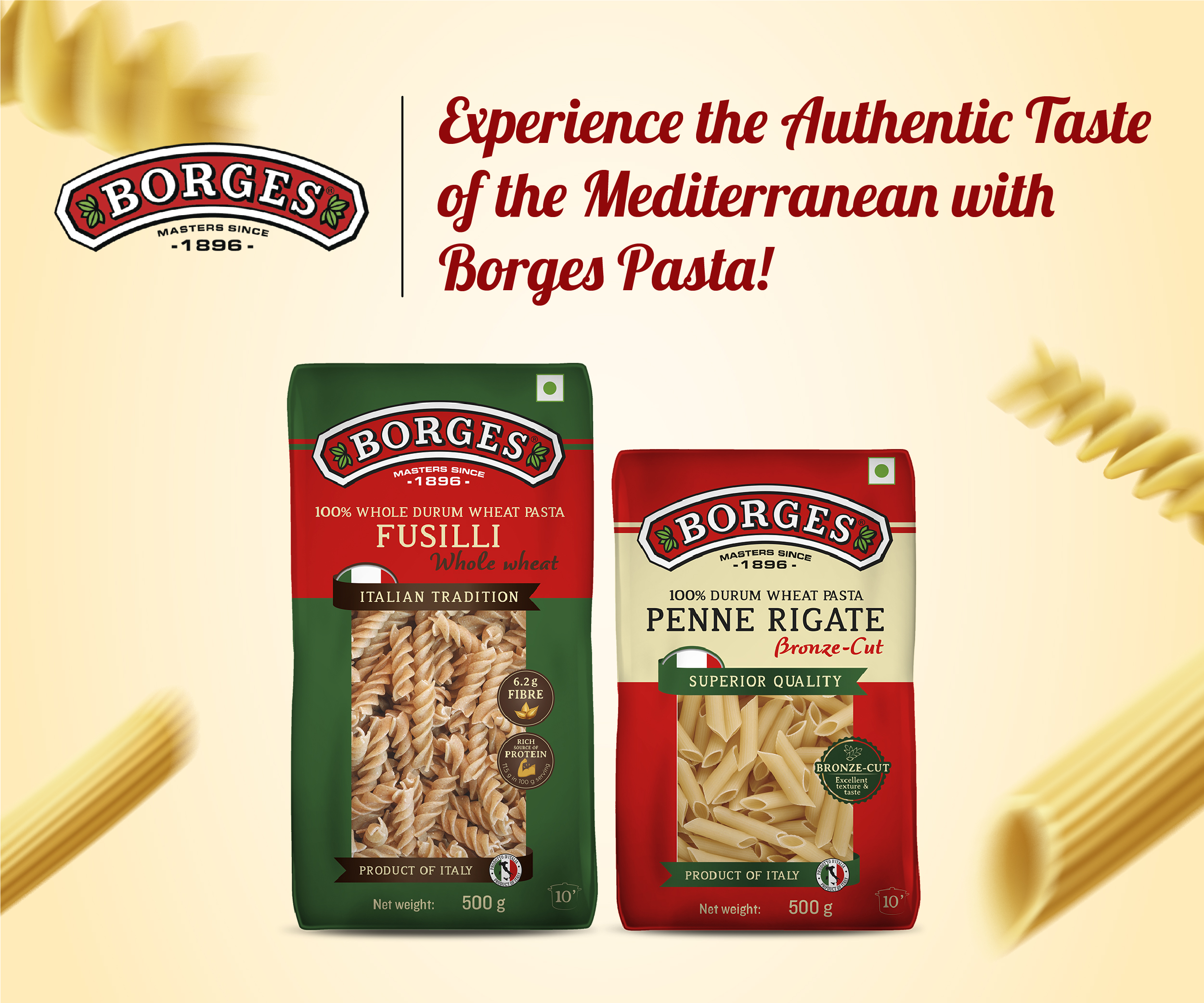
Borges International Group is a 125-year-old Spanish food company — olive oils, pasta, nuts, vinegars — present in over 100 countries and built on a Mediterranean heritage that is immediately legible in its home market. In India, that same heritage needed translation.
I joined as Lead Designer for the Indian market through VUI Live, Borges India's creative agency partner. I reported directly to the Senior Manager for Borges India and held creative responsibility for the brand's entire output across digital, e-commerce, performance marketing, and print — for the full Indian market, across every consumer touchpoint.
When I arrived, the brand guidelines existed. The design consistency did not.
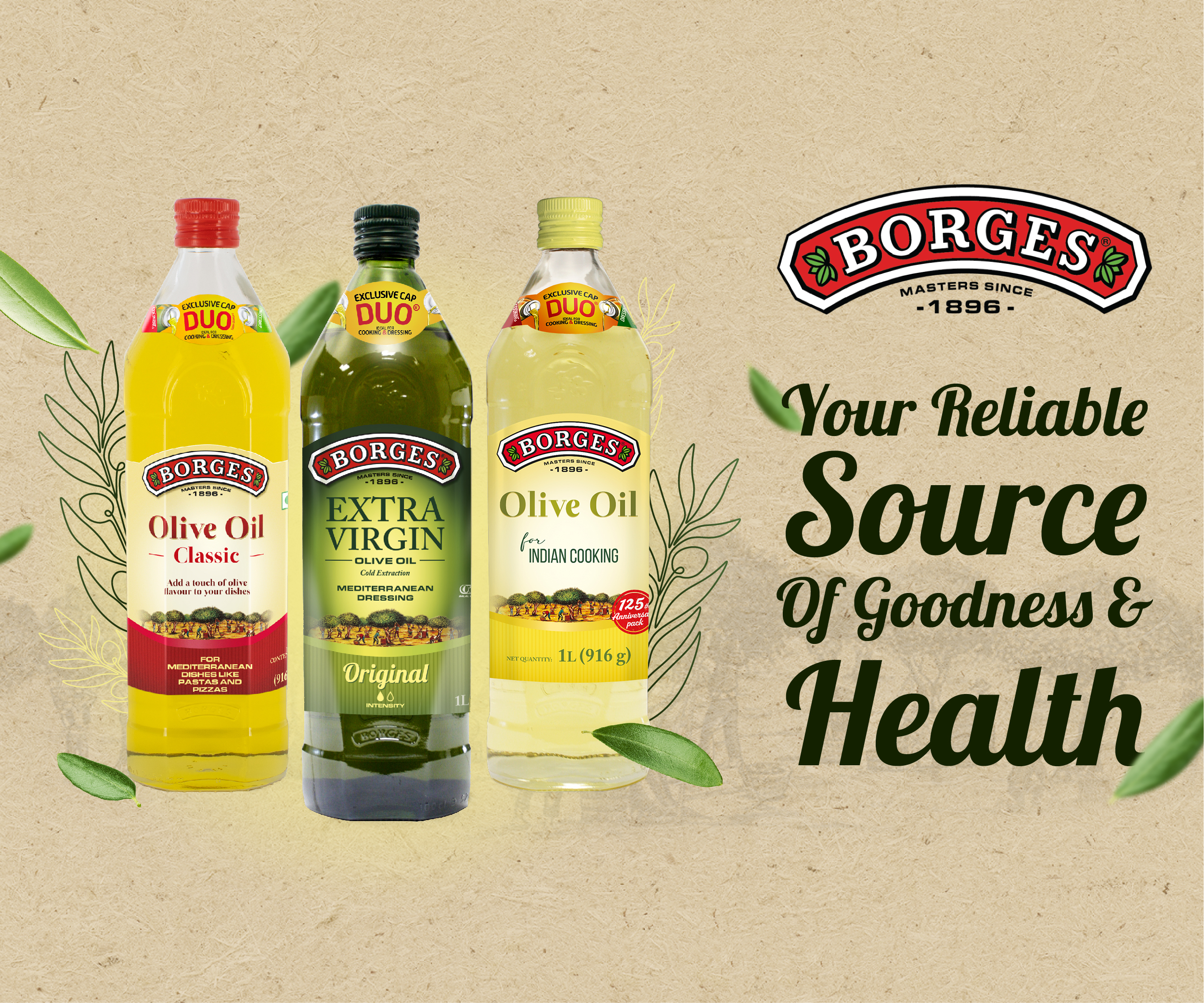
The visual identity Borges had established globally was clean, warm, and Mediterranean — natural tones, product-first compositions, a sense of heritage and quality. None of the designers before me had applied it with consistency. There was no coherent visual language in the Indian market output, no template system, and no design logic that connected what appeared on Amazon to what appeared on Instagram.
That was the operational problem. The strategic problem was harder.
Borges is a premium European food brand entering a market where consumers have deep loyalty to domestic brands they grew up with — brands they associate with trust, familiarity, and value. Olive oil and pasta exist in Indian kitchens, but under different names and in different cultural contexts. A direct translation of Mediterranean lifestyle positioning would land as foreign and irrelevant to the Tier 1 and Tier 2 audiences Borges was targeting.
The challenge was not to erase the brand's European identity — it was to make that identity feel like it belonged in an Indian kitchen.
Before opening any software, my process for every brief was consistent: understand the subject, break the brief into workable parts, build a moodboard that shows the direction before any design begins. Only then does the work start.
For the Indian market specifically, Borges had developed a product range adapted for Indian cooking methods and cuisine. That was the strategic entry point — these weren't foreign products being imported wholesale, they were Mediterranean ingredients reframed for the way Indian households actually cook. My creative work was built around that idea: not "European premium," but "the best version of something you already use."
Connecting a Spanish heritage brand to Diwali, Holi, Independence Day, and the rhythms of the Indian festival calendar required careful creative judgment. The Mediterranean warmth of the brand — its natural colours, its product-first honesty — turned out to translate well into Indian festival aesthetics when handled with respect for both visual languages. The Holi and Diwali campaigns were the clearest test of this, and they became the work I'm most proud of from this engagement.
Early in the relationship, there were creative disagreements. My approach was systematic: rather than defending a position, I ran A/B tests — my direction against the client's preferred direction — across three to four rounds. The performance data settled the argument. From that point, the trust was established and the creative process ran smoothly.
The first structural problem I addressed was the absence of a design system. I built one from scratch — specific to the Indian market — covering:
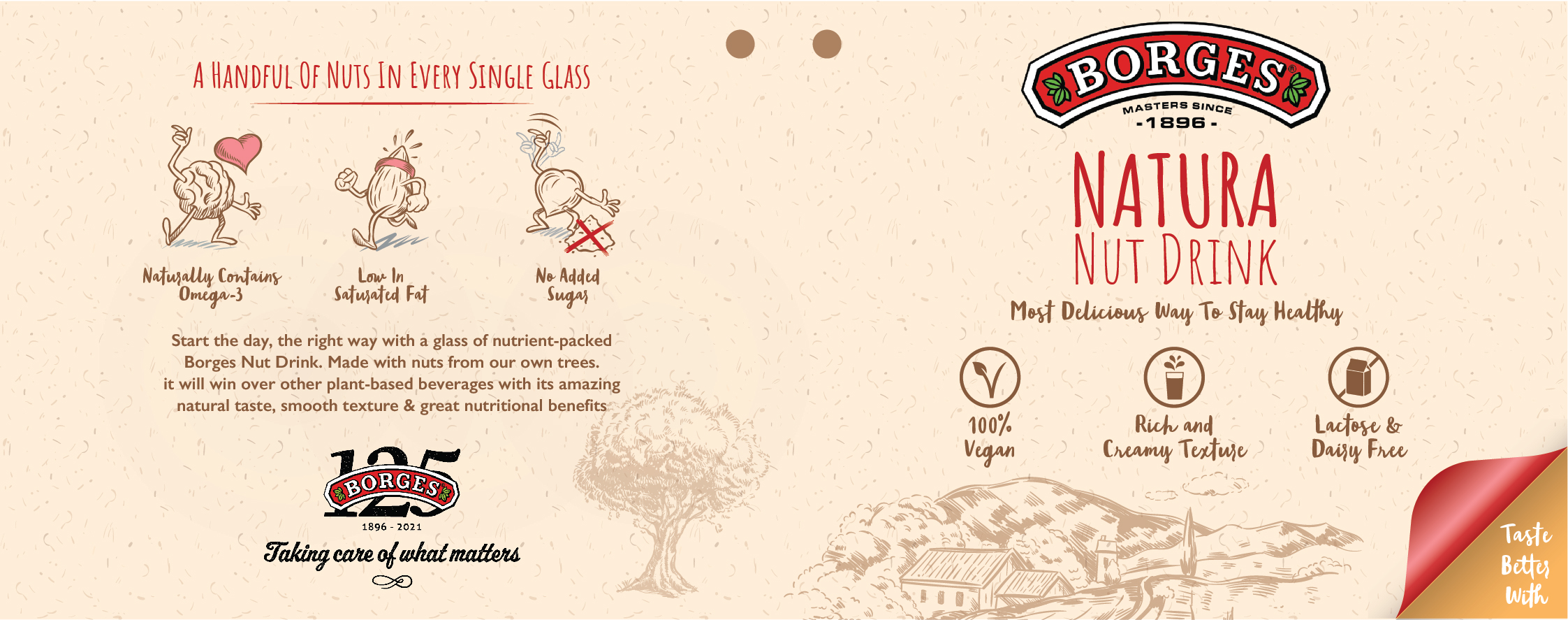
• A defined colour palette adapted from the global brand guidelines for Indian digital contexts
• Typography standards and a library of brand-consistent graphic elements
• Template architecture for every recurring format: social posts, carousels, story sets, reels, paid ad variants, emailers, and e-commerce listings
The intent was explicit: once the system existed, any competent designer could produce on-brand Borges India creative without my direct involvement. The brand's visual consistency should not depend on one person.
I also redesigned the entire Amazon store and product listing suite — new listing images, enhanced A+ content, and infographic formats — which became the standard across all e-commerce platforms. Those assets are still live.
Scope of output across the full engagement:
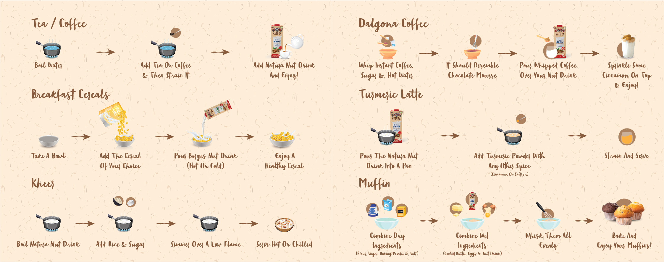
• 200+ static creatives — social posts, carousels, story sets, campaign key visuals, festival creatives, website banners, emailers, packaging adaptations, in-store POSM
• 40+ motion design pieces — animated social content, product highlights, platform-optimised reels
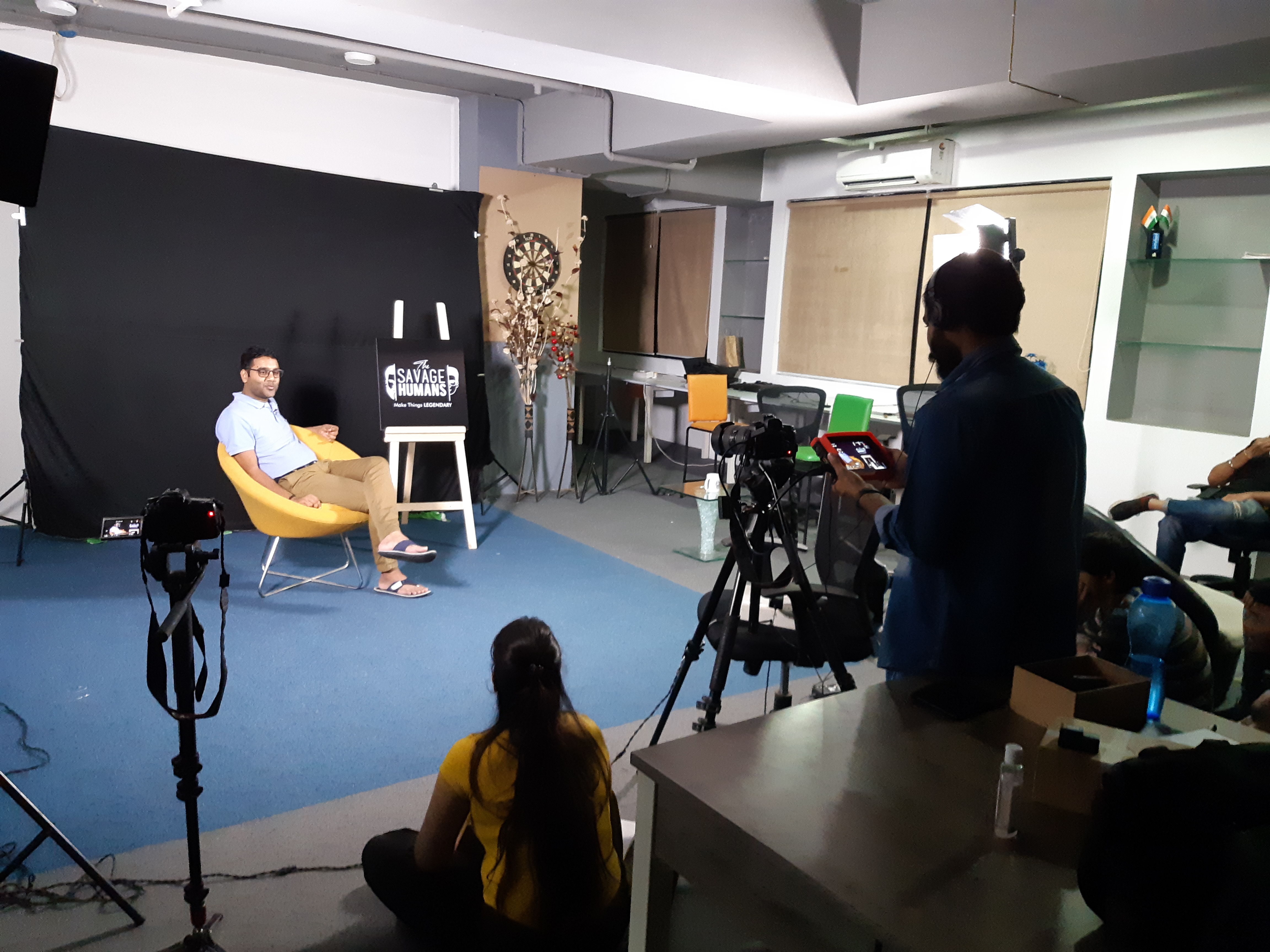
• 10+ videos — recipe content, product storytelling, performance ad edits
• Full Amazon store redesign — listing images, A+ content, brand store architecture
• Paid advertising creative — Meta static, carousel and video formats, Google display banners, A/B tested variants for retargeting
Platforms covered: Instagram, Facebook, Amazon, Flipkart, Swiggy Instamart, brand website
Tools used:
• Adobe Illustrator & Photoshop — all static creative and brand asset production
• Adobe After Effects — motion design, animated social content, creative experimentation
• Adobe Premiere Pro & DaVinci Resolve — video production and colour grading
• Platform-native formats — all output sized and optimised per platform specification
The most technically and creatively complex single project was the full Amazon store and listing redesign — rebuilding the entire product range's e-commerce presence with a consistent visual language, optimised for conversion, across every SKU.
The campaigns I found most creatively demanding were the Indian festival editions — Holi and Diwali specifically — where the brief required merging a Mediterranean brand identity with Indian cultural visual language without compromising either.
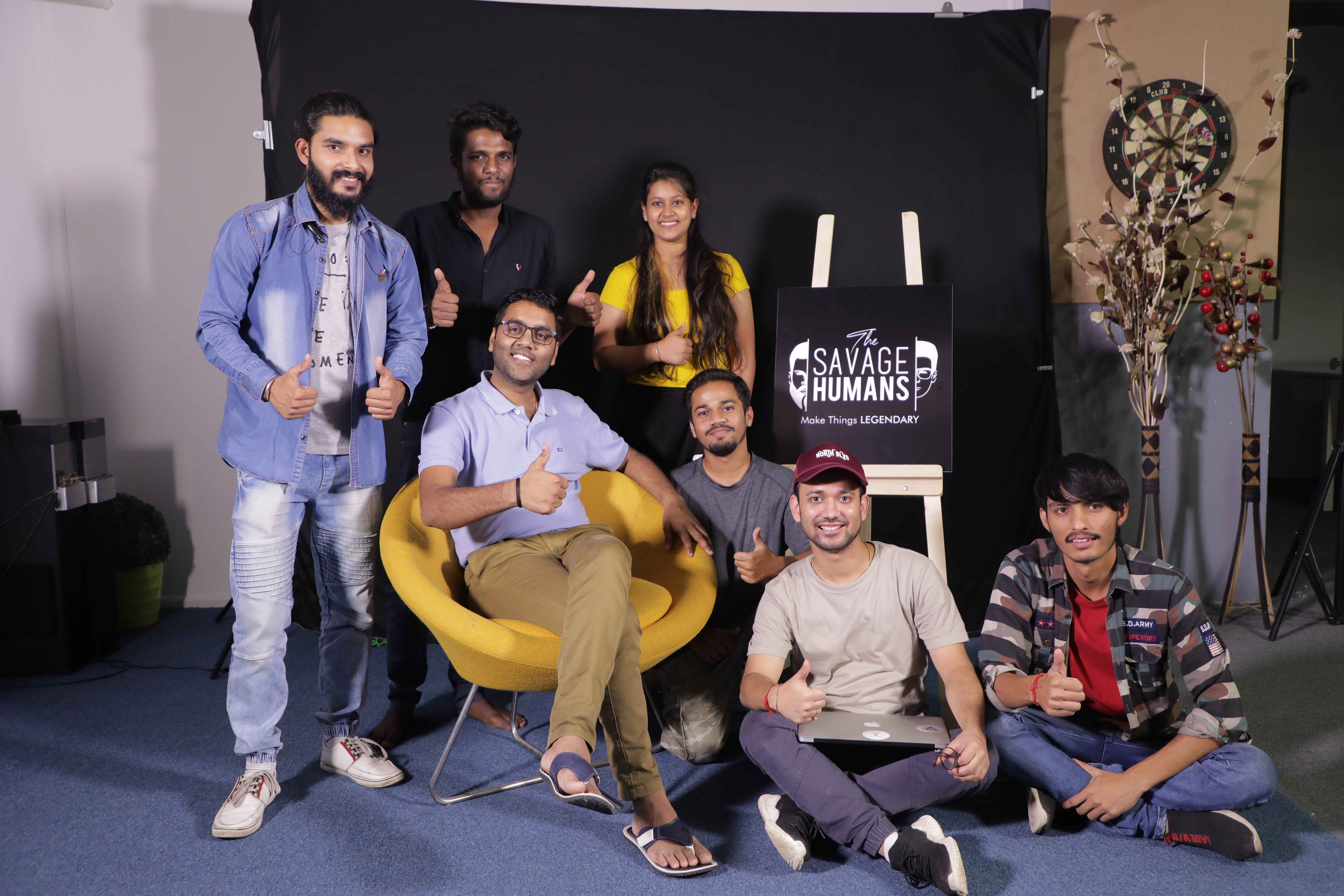
I managed a core team of three for Borges — one graphic designer, the Senior Manager, and their assistant — with an additional two-person team for e-commerce work. When campaign volume peaked, I brought in further support from the wider VUI Live team, scaling to five or six people at busiest periods.
My remit covered graphic designers, motion designers, and photographers. I also collaborated regularly with the paid ads team to develop format-specific creative for performance campaigns.
Briefs moved through two to three revision cycles on average. The approval chain ran through the Senior Manager and their superior. Communication was continuous and direct — close enough that the working relationship became genuinely collaborative rather than transactional.
During my tenure, Borges India's Instagram following grew from 5,000 to 15,000 — a threefold increase driven by a consistent creative refresh, product-led storytelling, and a festival content calendar that kept the brand present at every major Indian cultural moment.
The 30% organic growth figure reflects platform analytics tracked across Instagram Insights and monthly performance reports. The correlation between active campaign periods and e-commerce sales uplift was directionally strong — particularly during the olive oil positioning campaign, which significantly outperformed standard engagement benchmarks and drove measurable interest during the campaign window. Sales attribution across digital campaigns is rarely clean, but the pattern was consistent enough across multiple campaigns to be meaningful.
The clearest commercial signal: the client expanded the scope of engagement for an additional year.
Some of the creative work produced during this period remains live on Amazon and other e-commerce platforms — more than a year after the engagement ended. In brand design, that kind of shelf life is its own form of validation.